Sprawl, Huh! What is it Good For?
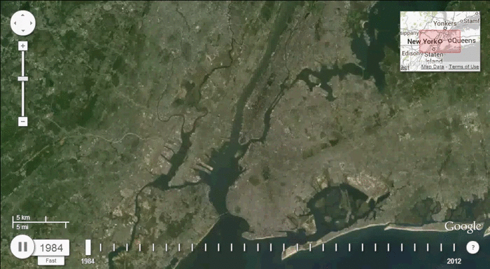
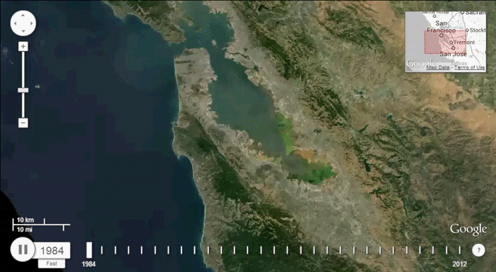
Last week we gave a micro view of the embiggened American home. Today, thanks to Google and the US Geological Survey’s Landsat images, we see the macro view. The GIF’s below, made by Texas architect Samuel Aston Williams, show the Houston, Dallas/Fort Worth, Chicago, NYC, San Francisco and Los Angeles metro areas as they grow from 1984-2012. The ever-sprawling burbs look like spilled milk over once-green hinterlands.
Of course the images don’t tell the full picture, e.g. how the increase in sprawl relates to overall US population or how these spread out cities might be the product of an increasingly urban country (in other words, the increased size of one area might translate to a major decrease in another, more remote locale). Nonetheless, these images, coupled with consistent data showing the ballooning American home size, paint a picture of a country that might need a serious edit.
click on image to enlarge